Font Collections
This is our series of beautiful, inspiring collections of fonts and typefaces. These articles feature bold poster fonts, decorative scripts, and everything in-between! Find the perfect font for your next design project with one of these collections.
Whether you’re looking for a particular type of font or a style of typeface that matches an event or theme, we’ve got you covered. Some of these fonts are free, others are included in an Envato Elements subscriptions, and many cost just a few dollars. The typeface makes the design, and these fonts can elevate your work to a whole new level!
Latest Font Collection Articles
5 Jan 2024
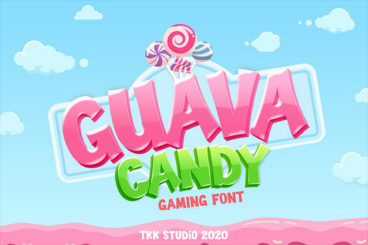
30+ Best Gaming Fonts in 2024 (Free & Premium)
The gaming industry is now even bigger than Hollywood and it continues to grow every year. Great designs are in fact partly responsible for the success of many great video games.
Whether it’s the colorful graphics on a landing page website, social media posts used to promote games, or the preview images on the App Store page, it’s these designs that attract more people to download games and try them out in the first place.
If you’re a designer working on promoting a game, finding an appropriate font should be one of your top priorities. We handpicked some cool gaming fonts to help you get started.
These fonts come in all kinds of styles and designs. You can use them to design promotional material for games or even craft titles for your YouTube covers and Twitch profiles. Check them out below.
4 Jan 2024
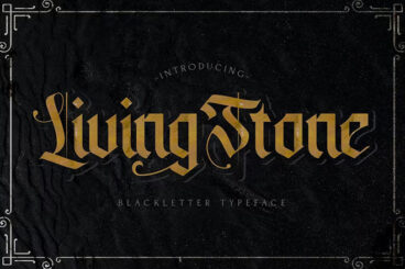
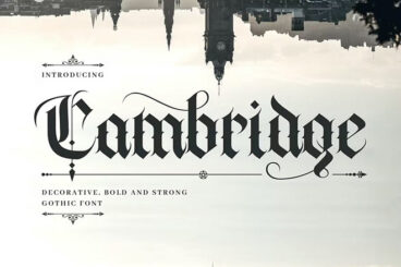
25+ Vintage “Old English” Fonts & Traditional Typography
The history behind the old English typefaces (also known as Blackletter fonts) goes all the way back to the Middle Ages.
This beautiful font type has a rich history even involving kings and queens. In fact, Johannes Gutenberg, the father of the printing press, used a blackletter font to print the first copy of the Gutenberg Bible.
Even today, designers use old English fonts to recreate that same elegant, traditional, and vintage look in their designs. Now, we carry the tradition over to new generations with our collection of the best old English fonts.
Here, you’ll find many different styles of traditional old English fonts, gothic fonts, black letter fonts, and much more. Have a look and make sure to download all the fonts. We included both free and premium picks.
3 Jan 2024
What Is Leading in Typography? + Tips & Examples
In the world of typography, ‘leading’ (pronounced as ‘ledding’) is a term that often surfaces, especially in discussions about readability and design aesthetics.
Originating from the days of manual typesetting, leading remains a fundamental aspect of modern typography. It impacts how text is perceived and can dramatically influence the readability and overall look of a printed page or digital screen.
In this comprehensive guide, we delve into the concept of leading, its significance, and how to effectively apply it in your typographic work.
1 Jan 2024
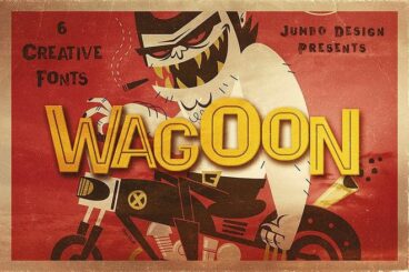
20+ Best Wacky & Wild Fonts for a Crazy Look
If you’re a designer looking for something crazier than Comic Sans? Then you’ve come to the perfect place. In this post, we share some of the wackiest fonts you can find for your wild design projects.
These fonts are not for everyone. They cater especially to designers with a taste for the bizarre. As well as for adding that vibrancy and eccentricity to their work. You’ll discover a plethora of wacky fonts, designed to bring humor, quirkiness, and a surreal aesthetic to any design project.
Not only are these wild fonts a diversion from the usual design palette, but they also serve a unique functionality. They force the viewer to stop, take a moment, and appreciate the creativity that goes into a unique design. Dive in, and let your creativity run wild with our selection..
4 Reasons to Use a Premium Font or Typeface
“Typography is two-dimensional architecture, based on experience and imagination, and guided by rules and readability.” – Hermann Zapf, legendary German type designer (Palatino, Optima, Zapfino)
There are two classes of typefaces when it comes to licensing – free or premium. While there are plenty of options for each type of font, there are some distinct advantages to selecting a premium option.
Premium typefaces are often sold by larger foundries or are part of collections such as Typekit. Prices can vary widely.
- Premium fonts come with extended characters and glyphs. Have you ever run into a font that didn’t have an ampersand or comma? That’s a common problem with many free fonts, and isn’t the case with premium options.
- Premium fonts won’t degrade in quality when used at large sizes and have been tested to render on multiple browsers and devices.
- Premium fonts have a character consistently to ensure that the family looks like it goes together among different characters and weights.
- Premium fonts often include multi-language support and come with a license so you know when you are using it legally.
How to Install a Font on a Mac
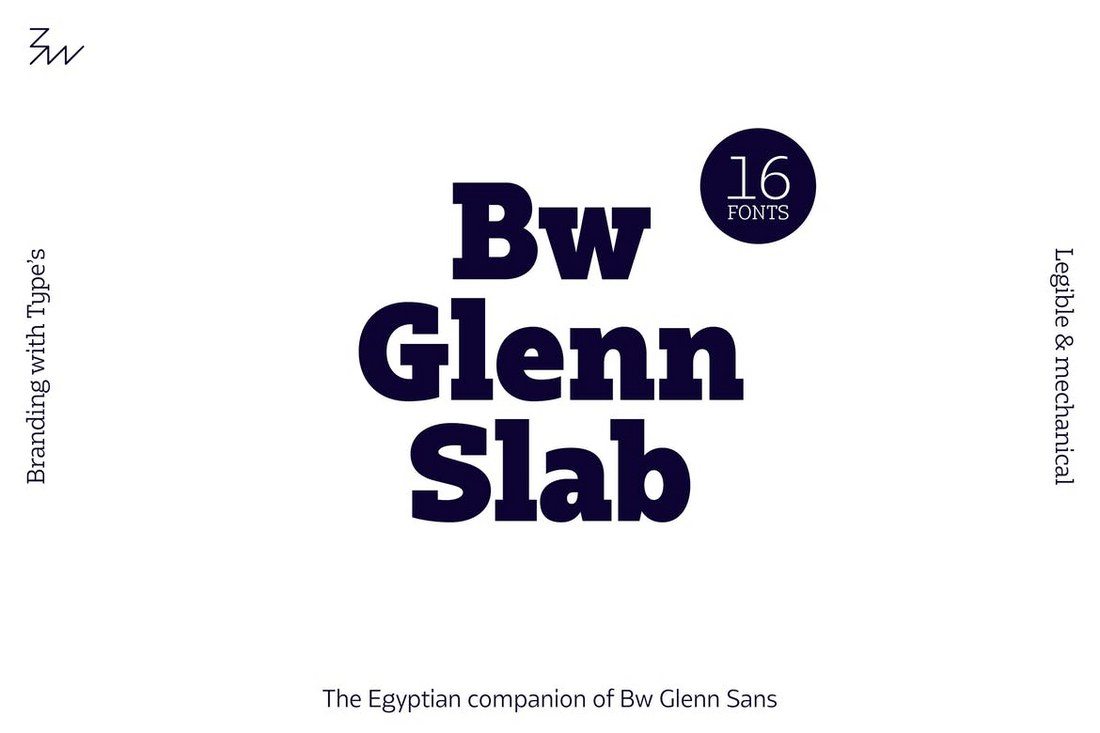
Installing a font on Mac operating systems just takes a couple clicks, using the Font Book app.
After downloading the font (make sure to unzip it), double-click the font icon and a window will pop up in font book that shows the name and basic character set. Click install to add to your default font set, using default preferences. (You can change these settings in the Font Book preferences.)
How to Install a Font on Windows
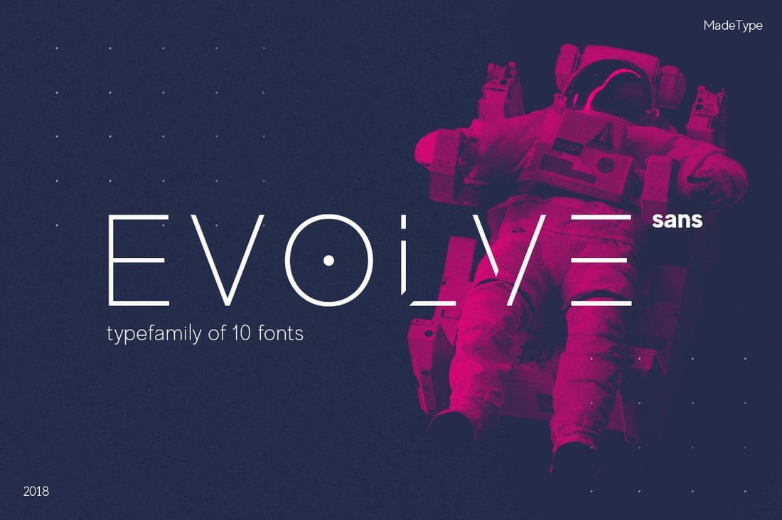
Adding a font on Windows is equally simple. (Note that administrator access is required to install on Windows NT 4.0, Windows 2000, Windows XP, or Windows Server 2003.)
After downloading the font (make sure to unzip it), right click on the font file and select Install.
The alternate method is to open the Fonts Control Panel and Fonts Manager. Then drag and drop the unzipped font file into the Fonts Manager to install.
3 Tips for Pairing Fonts
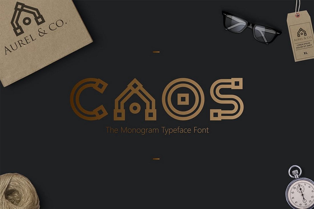
Most projects aren’t a one-font design. Pairing typefaces is an art in itself, but it is a little easier with these tips to help you create amazing font pairs.
- Look for typefaces with similar shapes: Think about whether each typeface is more round or oval, thick or thin, or tilts.
- Mix type styles: Use a serif and a sans serif or a script and sans serif. Paring different type styles is more visually interesting than mixing similar typefaces.
- Create plenty of contrast: Typography pairs need plenty of contrast to stand out. Pair fonts in different sizes, styles, color and use so that each font serves a distinct purpose.
