The Lowdown on Absolute vs. Relative Positioning
When I was first learning web development, the style side of CSS seemed straightforward and fun, but performing layout feats seemed like a confusing mess. I sort of felt my way around without a solid understanding of how things like positioning and floats worked and as a result it would take hours to perform even simple tasks. If this situation sounds familiar, then this article is for you.
One of the real revelations that I had early on was when I was finally able to wrap my head around how positioning contexts worked, especially when it came to the difference between absolute and relative positioning.
Today we’re going to tackle this subject and make sure you know exactly how and when to apply a specific positioning context to a given element.
2 Million+ Digital Assets, With Unlimited Downloads
Get unlimited downloads of 2 million+ design resources, themes, templates, photos, graphics and more. Envato Elements starts at $16 per month, and is the best creative subscription we've ever seen.
5 Different Position Values
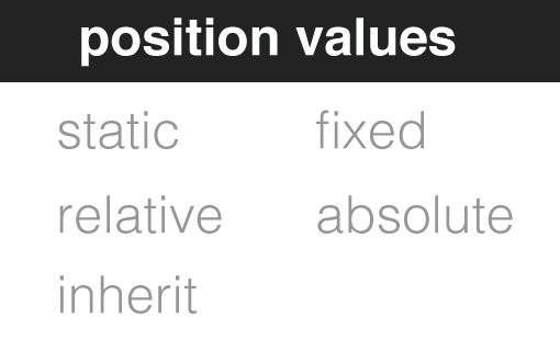
Let’s get some complexity out of the way up front. In reality, there are a whopping five different possible values for the position property. We’ll largely skip over inherit because it’s pretty self explanatory (simply inherits the value of its parent) and isn’t really supported well in older versions of IE.
The default position value for any element on the page is static. Any element with a static positioning context will simply fall where you expect it to in the flow of the document. This of course entirely depends on the structure of your HTML.
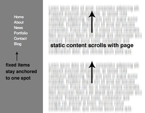
Another value that you’ve no doubt seen is fixed. This essentially anchors an object to the background so that wherever you place it, there it will stay. We often see this used on sidebar navigation elements. After scrolling down a long page of content, it’s a pain to go back to the top to navigate elsewhere so applying a fixed position to the navigation means the user never loses site of the menu. Click the image below to see a live example of this in action.
So there you have three position values that are fairly straightforward and easy to wrap your mind around. The final two are of course absolute and relative. Let’s focus on explaining these independently and then take a look at how they can be used together to achieve unique results.
Absolute Positioning
Absolute positioning allows you to remove an object from the typical flow of the document and place it at a specific point on the page. To see how this works, let’s set up a simple unordered list of items that we’ll turn into clearly discernible rectangles.
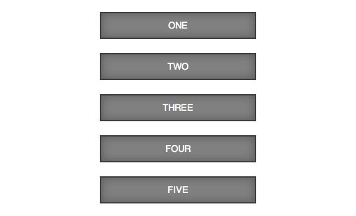
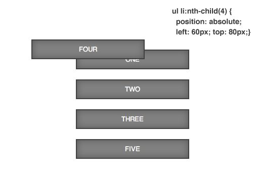
As we’ve already learned, by default these items will have a static position applied. That means they follow the standard flow of the document and are positioned according to the margins that I’ve placed on the list. Now let’s see what happens if I target one of these list items and apply a value of absolute to the position property.
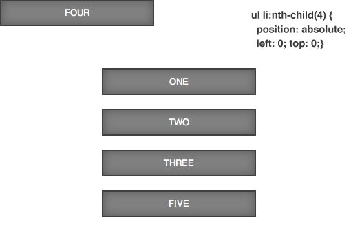
As you can see, the fourth list item was completely removed from the normal flow and placed at the top left corner of the browser window. Note that even if there were other content occupying this position, this element wouldn’t care. When something has absolute positioning applied, it neither affects nor is affected by other elements in the normal flow of the page.
The reason for absolute positioning is so we can position this item precisely where we want it. We do this with the top, bottom, left and right CSS properties. For instance, let’s say we wanted the fourth list item to be placed twenty pixels from the topside of the browser window and twenty pixels from the left side.
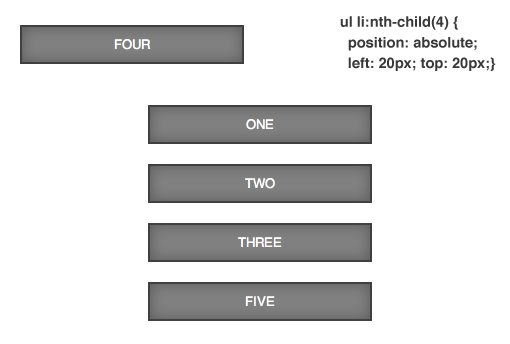
To prove our earlier point about absolutely positioned items not interacting with other content, let’s move the fourth list item right into the territory of the other list items. Watch how it simply overlaps the existing content instead of pushing it around. Click on the image below to see and tweak a live example of this test.
As one final note, notice how the fifth list item occupies the position previously held by the fourth rather than holding its position as if the fourth were still in place. Since the fourth item has been removed from the flow, everything else will adjust accordingly.
Relative Positioning
Relative positioning works similarly to absolute positioning in that you can use top, bottom, left and right to scoot an object to a specific point on the page. The primary difference is the origin or starting point for the element. As we saw above, with absolute positioning, the starting point was at the very top left of the browser window. Check out what happens when we apply relative positioning though:
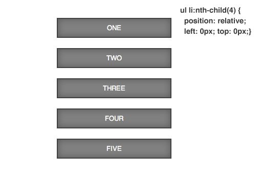
Nothing happened! Or did it? As it turns out, the object is indeed relatively positioned now, but its starting point is where it normally lies in the flow of the document, not the top left of the page. Now if we apply the same 20px adjustments that we used before, the result is quite different.
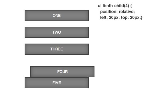
This time the item was moved “relative” to its starting position. This is extremely helpful for when you want to slightly tweak an object’s position rather than completely reset it altogether. Notice that, just as with absolute positioning, the relatively positioned object doesn’t care about other items in the normal low of the page. However, the original position occupied by the relatively positioned element hasn’t been occupied by the next list item as it did with absolutely positioned elements, instead the document acts as if the fourth item still occupies that position.
Putting Them Together
Now that you know how absolute and relative positioning work on their own, it’s time to dive into a more complex example and see how they can work together in a truly useful manner. This time we’re going to build a nice little demo to show off how it all works.
HTML
Start with a simple div with a class of “photo” and place a 200x200px image inside. This is all the HTML we need so after you’ve got this, move over to some CSS.
<div class="photo">
  <img src="http://lorempixum.com/200/200/people/9" />
</div>
Basic CSS
In your CSS, start by changing the body color to something dark. Then apply some basic styles to the photo element and give it some nice border and shadow styles.
body {
  background: #222;
}

.photo {
  border: 5px solid white;
  height: 200px;
  width: 200px;
  margin: 50px auto;


  /*overly complex but cool shadow*/
  -webkit-box-shadow: 0px 10px 7px rgba(0,0,0,0.4), 0px 20px 10px rgba(0,0,0,0.2);
     -moz-box-shadow: 0px 10px 7px rgba(0,0,0,0.4), 0px 20px 10px rgba(0,0,0,0.2);
          box-shadow: 0px 10px 7px rgba(0,0,0,0.4), 0px 20px 10px rgba(0,0,0,0.2);
}
[/code]
</div>
Here’s the resulting image. It’s nothing special, but it will provide a great testing ground for our positioning experiment.

Applying a Strip of Tape
Let’s say we wanted to create the illusion that this photo was hanging from the background, connected by a small strip of tape. To pull this off, we’ll need to flex our newfound positioning muscle and leverage some pseudo elements.
The first thing we want to do is use the :before pseudo element to create our strip of tape. We’ll give it a height of 20px and a width of 100px, then set the background to white at 50% opacity. I’ll finish by adding in a slight box-shadow.
.photo:before {
  content: "";
  height: 20px;
  width: 100px;
  background: rgba(255,255,255,0.5);

  -webkit-box-shadow: 0px 1px 3px rgba(0,0,0,0.4);
     -moz-box-shadow: 0px 1px 3px rgba(0,0,0,0.4);
          box-shadow: 0px 1px 3px rgba(0,0,0,0.4);
}
If we look at a live preview of our page after this code, we can see that we really screwed up our image. The piece of tape is really interfering with the flow of the document. Even though it’s not really visible, it has bumped our image right out of its border!

Obviously, we’ve got some issues with how the pseudo element is being positioned. To attempt to fix this, let’s see what happens if we apply relative positioning to the piece of tape.
.photo:before {
  content: "";
  height: 20px;
  width: 100px;
  background: rgba(255,255,255,0.5);
  position: relative;
  top: 0px;
  left: 0px;

  -webkit-box-shadow: 0px 1px 3px rgba(0,0,0,0.4);
     -moz-box-shadow: 0px 1px 3px rgba(0,0,0,0.4);
          box-shadow: 0px 1px 3px rgba(0,0,0,0.4);
}
Here’s the effect of this code:

As you can see, we didn’t fix our problem, everything is just as screwed up as before. Since this didn’t work, let’s take the opposite route and see what happens if we use absolute positioning.
.photo:before {
  content: "";
  height: 20px;
  width: 100px;
  background: rgba(255,255,255,0.5);
  position: absolute;
  top: 0px;
  left: 0px;

  -webkit-box-shadow: 0px 1px 3px rgba(0,0,0,0.4);
     -moz-box-shadow: 0px 1px 3px rgba(0,0,0,0.4);
          box-shadow: 0px 1px 3px rgba(0,0,0,0.4);
}
Here’s what our demo looks like now:
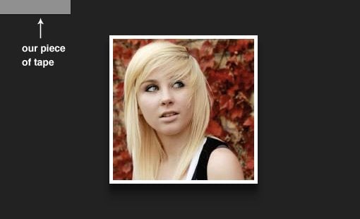
Our tape has finally made an appearance! Unfortunately, it’s way up in the corner. We could nudge it into place with the top and left values, but that wouldn’t actually be a workable solution. The reason is that this would put the tape at a specific point on the background, where it would stay no matter what. However, the image has been automatically centered in the viewport so as you change the window size it actually moves, meaning the piece of tape won’t be correctly positioned anymore.
So now we’ve tried both relative and absolute positioning with neither providing the solution we want. Where do we turn next? As it turns out, we haven’t really gotten the full story behind absolute positioning yet. You see, it doesn’t always default to the top left of the browser window. Instead, what position: absolute; really does is position the element relative to its first non-statically-positioned ancestor (inherit doesn’t count either). Since there hasn’t been one of those in previous examples, it was simply reset to the origin of the page.
So how does this translate into useful information? It turns out, we can use absolute positioning on our piece of tape, but we first need to add a positioning context to its ancestor, the photo. Now, we don’t want to absolutely position that element because we don’t want it to move anywhere. Thus, we apply relative positioning to it. Let’s see what this looks like.
.photo {
  margin: 50px auto;
  border: 5px solid white;
  width: 200px;
  height: 200px;
  position: relative;

  /*overly complex but cool shadow*/
  -webkit-box-shadow: 0px 10px 7px rgba(0,0,0,0.4), 0px 20px 10px rgba(0,0,0,0.2);
     -moz-box-shadow: 0px 10px 7px rgba(0,0,0,0.4), 0px 20px 10px rgba(0,0,0,0.2);
          box-shadow: 0px 10px 7px rgba(0,0,0,0.4), 0px 20px 10px rgba(0,0,0,0.2);
}


.photo:before {
  content: "";
  height: 20px;
  width: 100px;
  background: rgba(255,255,255,0.5);
  position: absolute;
  top: 0px;
  left: 0px;

  -webkit-box-shadow: 0px 1px 3px rgba(0,0,0,0.4);
     -moz-box-shadow: 0px 1px 3px rgba(0,0,0,0.4);
          box-shadow: 0px 1px 3px rgba(0,0,0,0.4);
}
As you can see, the pseudo element has absolute positioning applied, which means it will choose a starting point given the location of its first non-static ancestor. Since I’ve applied relative positioning to the photo, that item fits this description. So now our piece of tape will begin at the origin of the photo (even if the photo moves due to browser resizing).

Now that we have found the starting position that we were looking for, we can tweak the top and left values to nudge the tape into place. Notice that I’ve applied a negative value to the top property so the tape sticks out of the image onto the background. The left position is set to center the tape horizontally (click here to see how the math works out).
.photo:before {
  content: "";
  height: 20px;
  width: 100px;
  background: rgba(255,255,255,0.5);
  position: absolute;
  top: -15px;
  left: 50px;

  -webkit-box-shadow: 0px 1px 3px rgba(0,0,0,0.4);
     -moz-box-shadow: 0px 1px 3px rgba(0,0,0,0.4);
          box-shadow: 0px 1px 3px rgba(0,0,0,0.4);
}
As we can see in the finished version below, combining absolute and relative positioning was exactly what we needed to pull off the effect that we were going for. Click the image below to see and tweak the live demo.
A Quick Summary
Positioning contexts can be difficult to wield if you’re attempting to implement them without a solid foundation of knowledge behind how they work. Fortunately, there are only three primary pieces of information that you need to remember to master absolute and relative positioning.
The first is that relative positioning will allow you to tweak an element’s position relative to its normal starting point.
The second is that absolute positioning will allow you to tweak an element’s position relative to its first non-statically-positioned ancestor (defaults to page bounds if none is found).
The final piece of information to remember is that both relatively and absolutely positioned items won’t affect the static and fixed items around them (absolutely positioned items are removed from the flow, relatively positioned items occupy their original position).
